Back to Hub Updates to Tables on the Main Screens

All Meetings

Meeting Status

Use a row of four Bootstrap Icons in the status column. Completed steps use (text-success); pending steps use (meeting-status__dot--pending). In-progress steps between milestones use (bi-circle-half). Hovering the indicator shows a Bootstrap tooltip naming the current state.

Meeting status progression examples
Agenda Not Published
Agenda Published
Meeting Run
Minutes Generated
Minutes Saved
Minutes Marked Officially Approved
Minutes Signed

Hover any indicator above or in the table to preview the tooltip behavior.

Icon Conventions

  • The three-dot More icon should always denote opening the Actions menu. Use a separate icon for unpublished status.
  • The box-with-arrow-outward icon should only denote “open in a new window” or “share link”—not opening the meeting in the current window.
  • Standard shapes have implied meanings; be careful that a file icon could read as document or note, and a pencil icon could imply edit, notes, or signature. See the status mockups above for more differentiated icons.
More menu

Always opens the row Actions menu. Never reuse for visibility or status.

Unpublished

Dedicated visibility indicator. Reserve blank space in the column when not applicable.

New window / share

Only for external navigation or copying a share link—not in-row open.

Page Header & Actions

  • Place the page title first, then the primary Create button directly below it on the left—consistent with meeting detail tab toolbars in Enhance Meeting Minutes. Child navigation drawers repeat the action as a secondary shortcut at the top; see Top Level Navigation.
  • Page-level Create buttons can remain on listing screens for context (for example Create Meeting on All Meetings) while a future topbar Create menu serves as the always-available entry point.
  • Secondary actions such as Export and Print belong on the right of the same toolbar row—not in the table header or sidebar. This replaces the current gear-icon export placement above the table.
  • A Filter control opens a rule builder for column-specific terms (contains, does not contain, is empty, is not empty)—similar to Jira, Asana, and Airtable. Multiple rules combine with AND logic.
  • A column settings control (gear icon) opens a show/hide menu listing every column from the current product menu—ID, Name, Meeting Tags, Agenda Item Tags, Description, Status, Meeting Type, Unpublished Edits, Agenda, Meeting Date, Meeting Time, Created, Created By, Last Modified, Modified By, and Team—plus Visibility for the new mockup column. Save Layout, Restore Last Saved, and Restore Factory Default stay at the bottom.
  • A list / grid view toggle sits at the far right of that toolbar, matching the current product control but moved out of the table header.
  • Keep edit and publish actions near the content they affect rather than in the global topbar.

Table Conventions

  • Reorder columns to lead with the More menu, then Date and Name, followed by the status indicator and metadata columns from the current table: Meeting Tags, Agenda Item Tags, Description, Type, Unpublished Edits, Meeting Time, and Created.
  • The status column, visibility icon column, and More action button column should always appear in the same position. When there is no status or visibility icon, render a blank space so columns stay aligned.
  • Each sortable column heading includes a sort control that cycles ascending, descending, and unsorted. The actions column is excluded.
  • Add Open Meeting as the top item in the More menu. This removes the need for a separate Open icon column and saves horizontal space.
  • The meeting title should be clickable to open the meeting.
  • When the user has not entered a title, generate a sensible default from metadata—for example 
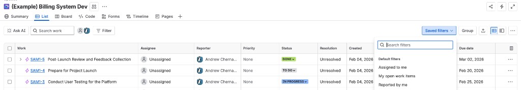
<short date> <meeting type> produces Feb 2 Supervisors Meeting.
Current meetings table column settings menu with checkmarks and layout restore actions
Current product column settings menu. The mockup moves this control into the page toolbar and keeps the same show/hide, save, and restore actions.

Global Create (Topbar)

  • Add a single top-level Create button in the topbar, in the slot currently used by the township/visibility control. Clicking it opens a menu to start a meeting, agenda item, document, or other supported type from any screen—similar to Asana’s global create control in the top left.
  • Relocate township, team, and role visibility controls elsewhere in the topbar (or into a compact settings menu) to make room for Create.

Similar Patterns

Reference screenshots from products with comparable listing screens, toolbars, and create flows.

Asana sidebar with Create button open, showing Task, Message, and Portfolio options
Asana — A single global Create control opens a short menu of content types. Primary navigation stays in the sidebar; creation is grouped rather than scattered across separate buttons.
Jira list view with filter, group, export, and layout controls above the work item table
Jira — Secondary actions and view controls sit above the table: saved filters, grouping, export/share, and a list/board toggle. Row actions stay in a trailing More menu.
Notion Meetings database with view tabs, filter and sort controls, and a New split button
Notion — View tabs switch between list, calendar, and filtered perspectives. Toolbar icons handle filter, sort, and layout; New stays visible at the right with a split-button dropdown.
Airtable grid view with hide fields, filter, group, sort, and share controls above the table
Airtable — Dense grid toolbar for field visibility, filter, group, sort, and share. Saved views live in the left sidebar; the main canvas focuses on the table and its controls.