Implementation Notes
Five requirement areas. Use the sidebar to jump.
App-wide Search
Prototype: meetings listing; try Search active in mockup states.
Behavior
- Center search in the topbar. Show all content types by default.
- Filter by content type with an inline dropdown. Group or icon results when names repeat.
- (Optional) Index routes and action labels (e.g. “Create Meeting”) for command-palette-style jumps.
Keyboard & focus
- Ctrl/Cmd+K focuses search; Enter submits; Esc closes; Up/Down moves results.
- Do not use Ctrl/Cmd+F—reserved for find-in-page.
- Show focus with shadow or overlay. Placeholder: “Search (Township name?)”
Alternatives
- Future: sidebar search icon opens a modal if the topbar is collapsed. Avoid floating search FABs.
- Tables may also use a narrow “Filter by Name/Title” field above the grid.
Updates to Tables on the Main Screens
Prototype: All Meetings listing — toolbar, status column, column settings, list/grid toggle. Click a name for detail.
Meeting Status
Four status pips per row, left to right: bronze (Agenda Published), silver (Meeting Run), gold (Minutes), platinum (Signed). Empty pips stay grey (bi-circle); in-progress uses bi-circle-half in the pip’s tier color. Fully complete rows (Minutes Signed) get a platinum glow. Tooltip names the current step.
Alternative mockup: Grey/green progress bar status — pills and pips on a filling track (not in the main table yet).
| Agenda Not Published | |
|---|---|
| Agenda Published | |
| Meeting Run | |
| Minutes Generated | |
| Minutes Saved | |
| Minutes Marked Officially Approved | |
| Minutes Signed |
Hover indicators in the table to preview tooltips.
Icon Conventions
- More (⋯) opens the row Actions menu only.
bi-box-arrow-up-right= new window or share link—not in-app open. bi-file-earmarkfor PDF/preview.bi-card-checklist/bi-card-headingfor published agenda and saved minutes quick links (blank when not ready).bi-eye/bi-eye-slashare reserved for public-visibility indicators outside the meetings list. Full reference: icon conventions.- In the prototype, clicking a document quick-link icon shows an alert naming the target file instead of opening it.
Row Actions only.
bi-eye / bi-eye-slash — reserved for detail surfaces, not the list table.
bi-eye-slash — not public when used outside the list.
External open or copy link.
Table Display
Column width
- Size columns to content; scroll horizontally. Pin columns from the Columns menu; defaults are Actions, Date, and Name.
- Title ellipsis + tooltip is optional. Never truncate Tags or other multi-value fields.
- Treat the table as a summary—full detail on the meeting page.
Filters, sort & columns
- Toolbar above the table: Filter, Sort, Columns—same button treatment, grouped together.
- Highlight active controls or show a badge count. Each opens a dropdown of active rules plus add-new (see Similar Patterns).
- Column heading click toggles sort priority and direction.
- Columns dropdown: show/hide, pin/unpin, and reorder. Pinned columns stay sticky while scrolling; drag-reorder only works within the pinned or unpinned group.
Save behavior
Saved views are templates. Load one, explore freely — your bookmark stays as you saved it. Re-click it anytime to start fresh from the template. Update it only when you mean to.
- Working state — filter, sort, column visibility, order, and pin changes apply immediately (no Apply button) and are continually remembered in the browser.
- Saved views (sidebar) — named templates via Save to sidebar. Refinements after loading a template update working state only; the template is never auto-overwritten.
- Clear / Reset — X on each filter or sort rule; Reset in each Filter, Sort, and Columns dropdown. Re-click a sidebar saved view to restore that template.
- Update — when the current view diverges from an active template, the Saved view menu offers Update saved view (explicit confirmation).
- Default — pinned first item in the sidebar Saved views section; returns to CiviDocs’ initial filters, sort, and columns.
- Copy view link / Share — explicit actions for customer support handoffs (current working state, not live address-bar sync).
- In the prototype, shared-view URLs use a
#meetings-view=hash; mockup states for search and minutes use separate hashes—only one applies at a time.
Context & visibility
- Workflow status: colored pips in the Status column (above).
- Township, team, and role: topbar Switch Context offcanvas (
bi-houses-fill). The meetings list does not include a public-visibility column. - When public visibility is shown elsewhere, use
bi-eye/bi-eye-slash—globe or lock icons are less clear. See icon conventions.
Toolbar & footer
- One Create Meeting button; Make Recurring lives in the dialog.
- Grid/List in the table footer. (Optional) row density toggle.
Global Create (topbar)
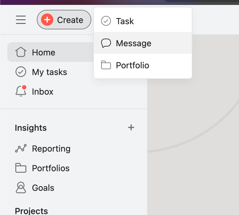
- Add topbar Create with menu for meeting, agenda item, document, etc.—like Asana.
- Move township/team controls elsewhere to make room.
Similar patterns



Run Meeting Screens
Prototype: use the Run Meeting mockup state.
Layout
- Keep v2 motions table: motioned/seconded columns left of member names.
- Separate prev/next from the item title. Motion text above voting; presentation/docs collapsible above that.
- Two-column lower section: voting left, discussion right.
Voting controls
- Toolbar above voters: Clear Motion/Second, method, Record Vote, All Yes/No, bulk Y/N/Abstain for selection.
- Checkboxes to apply one vote to multiple members. Keep Nobody row. Collapse Conditional Voters by default.
Discussion & outcome
- Click voter name to insert into discussion. Show abstain rationale inline.
- Outcome panel: Approved, Rejected, Deferred (with date), No Action Taken—vote tally moves here.
- Secondary Motions in the outcome area. Rename Copy Votes to Apply to Another with multi-select + confirm.
Enhance Meeting Minutes
Prototype: Minutes mockup states on meeting detail.
Generate, edit & enhance
- Generate Minutes dropdown with ordering before preview.
- Enhance Minutes in a side drawer; edit and PDF stay in the tab toolbar.
- After enhancement: diff highlights, Show/Hide Edits, optional CiviBot chat (two columns on wide screens).